Employee Portal
A series of unmoderated, UserZoom studies using an employee intranet portal test site.
What is the issue?
Research data and feedback showed that there were some usability issues for users performing tasks on the new employee portal test site. We needed to find pain points and solutions to make task flows smoother.
Defining the problem
Using Human Resources and Technology Support analytics data to determine most common tasks for employees, I planned multiple Usability studies using the pre-launch test site to find pain points and insights to inform design improvements for task flows.
Research Objectives
- Can users easily find a place to start their task on the portal?
- Do they feel confident they found a good place to start?
- Are they able to quickly find information to complete their assigned tasks?
- What pain points or facilitators emerge in these processes?

Methods
Twelve Unmoderated Usability studies using UserZoom and a portal test site. Each Usability test had 10 unique participants from a mixture of personas (120 total unique participants). Videos and data were recorded from these tests so we could see if there were any pain points or gaps to inform design changes.
Questions (Examples)
Click Test
Where were you find help (start your task) for a malfunctioning computer?
Open-ended
Now that you are on the test site, please find where to get help with your computer.
Your task is complete when you find information that may help you troubleshoot or a way to ask for help.
Quantitative rating
How confident are you that you found a good place to start your task?
Analysis

- An excel spreadsheet was created to compile data from UserZoom and organize for better analysis summaries.
- UzerZoom analytics were used to capture data from rating and multiple choice questions.
- Captured videos were reviewed to see what users said and how they progressed while completing their tasks.
- Heat map data was reviewed and recorded.
Findings
Examples of findings from a few Usability tests
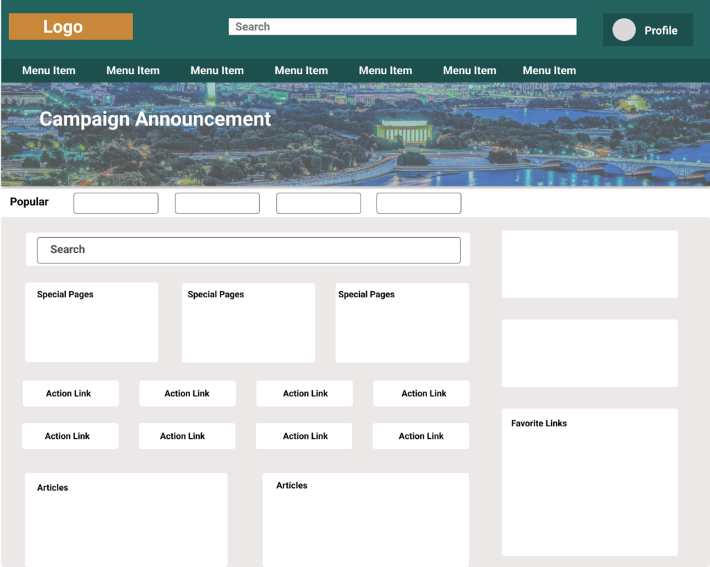
Users were unsure where to start to look for Technology help and needed a clearer call–to-action on the homepage.
Users could not find the form or the information they needed to add a new family member to their insurance.
Users could not easily find a link to a statement of their current benefits.
Recommendations
Call-to-Action
Users need obvious cues for viewing their current benefits, starting the process for changing benefits and opening a help desk ticket for HR and Technology Support. Many look to the homepage or drop-down menus to find these items.
Menu Quick Links
Main navigation drop-down menus are where users go to find action links when they don’t see them on the homepage. They should have the main category links to action items they are familiar with from their old system to reduce confusion and frustration.
Homepage Action Tiles
Consistent with previous studies, over 30% of users look at the homepage body to find what they need before looking elsewhere. The most common HR and IT tasks should have a starting point on the homepage.
Simplify Homepage
As in previous studies many users find the homepage to be crowded, they don’t want to scroll past a large banner. Consider a smaller banner, prioritizing most used tiles, adding section labeling, and creating space between items.
Impact
By making small changes to the menu and homepage most of the user pain points were addressed. Further studies and data were able to point to specific changes needed to make the homepage seem less crowded and give users confidence in using the site. See A/B Study


