Process
Planning & Development
Working cooperatively with stakeholders

A comprehensive and flexible research guideline to build UX research studies that inform and enhance design outcomes for business, stakeholders and users.
Test Plans/Protocols
UX Research Test Plan | Usability Studies for Employee Portal
Goal
Users should an easy time finding information they need and a starting place to complete tasks.
Research Objectives
- Can users easily find a place to start their task on the portal?
- Do they feel confident they found a good place to start?
- Are they able to find information they need quickly to complete their assigned task?
- What pain points, if any, emerge in these processes?
Stimuli
Portal test site: (Link)
Methods
Remote, unmoderated usability studies based on most viewed pages and Helpdesk analytics for most common tasks for HR and IT. UzerZoom platform tests to record 15-20 minute sessions for 12 scenario/task sets. 10-12 participants to be recruited from (company employees) mixed personas, roles and experience for each test. Up to 120 unique participants.
Test Protocol
For these sessions, participants will be given a scenario and asked to complete tasks using and capture any confusions/pain points during the process.
We will record participants’ feedback with video and audio, and the moderator will ask follow-up questions to clarify their actions, comments, and feedback.
We will be asking participants to complete the tasks and answer the questions below. This protocol is not suitable for collecting benchmark metrics such as time-on-task rates or tests of statistical significance.
Test Details
Warm-Up and Background
Thank you for participating in this study. Your feedback will help us design better experiences for everyone at the company. Please read the instructions carefully and speak out loud while completing your task.
Note: The following section changes with different scenarios and task questions reflecting other Usability tests. Examples of other test subject matter included:
- Technology Support for a malfunctioning computer
- Taking a Leave of Absence
- Leader Resources
- Timesheets
- Paychecks
- HR/IT Tickets and Shipments
- Continuing Education Credit Requirements
Scenario
Imagine you have a new family member and realize you need to make changes to your health insurance but first you want to see an overview of all your current benefits with the company.
Task Instruction
Find where you can view your current benefits, then find how and where to make a change to your health insurance. Your task is complete when you find the link that will take you to a report of your current benefits, you understand how to make a change to your insurance and you see a link that will take you to a place to make that change.
Tasks and Questions
- [verbal] You will now see a homepage screen of a website. Without selecting anything yet, what are your first impressions of the page?
- [click test] Please look at the page and decide where you might start your tasks of finding your current benefits and making a change? Go ahead and click on up to 3 places you think you could start your task.
- [rating] How confident do you feel that you found a good place to start to find what you need to complete your task? On a scale of 1-7, where 1 is not confident at all, and 7 is very confident.
- [verbal] [timeout 7 minutes] Please pick one a starting point and look for a way to find all the benefits you are currently enrolled in and find a place to make a change to your health insurance. Please talk out loud while completing our tasks. When you feel your task is complete click next.
- [rating] How easy was it to find the information you needed and complete your task? On a scale of 1-7, where
- [written] Was there anything in particular that you liked about using the site?
- [written] Was there anything in particular you disliked about using the site?
- [written] Do you have any ideas about what might make it easier for you to complete your task on the site? (optional)
- [written] Do you have any comments you would like to make about the site?
- [rating matrix] Please rate your agreement with the following statements about your experience on the site during this test. On a scale of 1-7, where 1 is strongly disagree and 7 is strongly agree.
- This site easy to use.
- I was able to find what I needed to complete my task.
- This site is attractive.
- I would need to learn a lot or get help to use this site.
- I would like to use this site often.
Wrap-Up
You have completed this test session. Thank you for your time and feedback.
A/B Study (Mixed Methods)
Background
New design enhancements meant to create a modern, cutting edge style did not lead to positive feedback from users. Working with the UX Designer I recommended changes based on research. This study tested the hypothesis that the new recommended design (B) would solve pain points and bring about positive changes before it was presented to stakeholders for review and approval.
Goal
It should be easy for users to find where to start tasks and get information they need website. They should feel confident that this site will give them a quick and easy way to access information and complete tasks.
Research Objectives
- Which site instills more confidence?
- Are users able to easily find a place to start and complete tasks?
- Will the new design solve pain points identified from recent studies and pilot data?
Stimuli
Current design prototype
UX recommend Changes prototype
Methods
Remote 30-minute, moderated A/B test including evaluative, interviews, and usability testing. Fourteen participants, mixed company personas, roles and experience including:
- Eight participants who are involved in a pilot program and have been interacting with the original design.
- These participants will see the site design they are familiar with (A) first and discuss their experiences interacting with it.
- Six participants who have not seen any site designs.
- The prototypes and questions will be counterbalanced for those who have not seen site designs to avoid bias for the design they see first.
Test Protocol and Script
Warm-Up and Background (All Participants)
Thank you for participating in this study. Your feedback will help us design better experiences for everyone at the company.
We are going to look at two designs for the employee website. First let’s look at the design you have been interacting with in the pilot. I would like to talk about your experiences interacting with this test site.
Tasks and Questions
Pilot Participants
Prototype A
- When you first saw the pilot site, what were your first impressions?
- What were your first impressions when you used the site to complete a task or look for information?
- What did you look for or do and how was the experience?
- Did they use the main menu? (Moderator observation)
- Did they use drop-down quick links? (Moderator observation)
- Did you look for any information in your profile?
- Did they notice the Profile? (Moderator observation)
- Did they create any Favorite Links? (Moderator observation)
Prototype B
- What are your first impressions of this homepage?
- Where would you look on this site to find a list of your current benefits?
- Where might you find a place to edit your contact information?
- If your computer was malfunctioning, where would you look to find help?
- Do they use the menu? (Moderator observation)
- Do they notice the drop-down quick links? (Moderator observation)
- Do they notice the Favorite Links? (Moderator observation)
- Do they notice the Favorite Links section? (Moderator observation)
Non-Pilot Participants (No Portal Exposure)
Prototype A (Counterbalanced)
- What are your first impressions of this homepage?
- Where would you look on this site to find a list of your current benefits?
- Where might you find a place to edit your contact information?
- If your computer was malfunctioning, where would you look to find help?
- Do they use the menu? (Moderator observation)
- Do they notice the drop-down quick links? (Moderator observation)
- Do they notice the Favorite Links? (Moderator observation)
Prototype B (Counterbalanced)
- What are your first impressions of this homepage?
- Where would you look on this site to find a list of your current benefits?
- Where might you find a place to edit your contact information?
- If your computer was malfunctioning, where would you look to find help?
- Do they use the menu? (Moderator observation)
- Do they notice the drop-down quick links? (Moderator observation)
- Do they notice the Favorite Links? (Moderator observation)
Wrap-up (All Participants A & B prototypes)
- For the first design you saw please rate the following:
- Is this site easy to use? On a scale of 1-7 where 1 is not easy to use and 7 was extremely easy to use.
- Are you confident you could find where to start a task or find information? On a scale of 1-7 where 1 not at all confident to use and 7 is extremely confident.
- Are there any features from your least favorite you would want to keep?
Those are all the questions I have for you today, do you have any other questions or comments? Thank you for your time today. Your feedback is very valuable and will help create better experiences for all employees. Have a great rest of your day and I hope to me
Report Examples
Evaluative Unmoderated Study
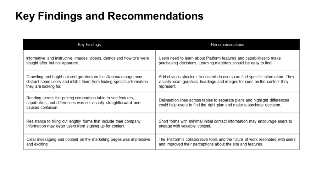
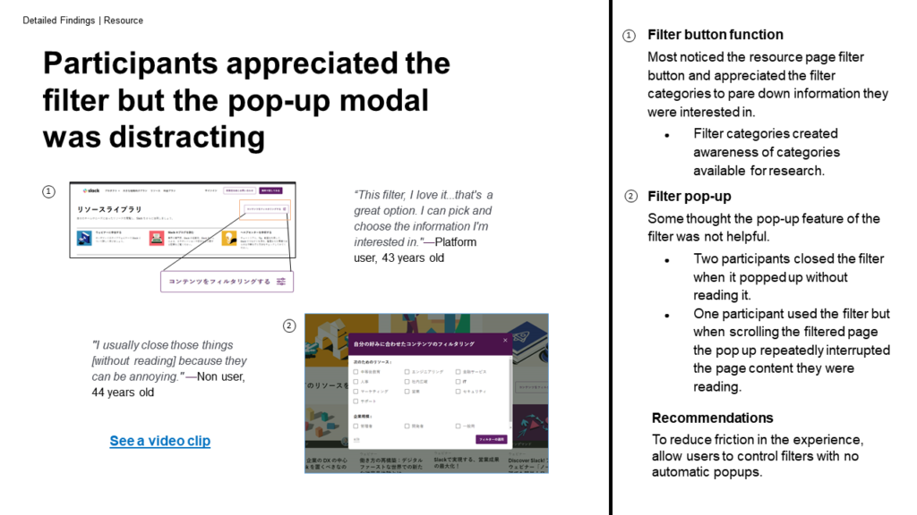
As part of a larger report or as a high level Executive Summary, major insights can be tailored to the needs of the stakeholders and project teams.


Slides cover detailed findings, highlighting elements and features that play a significant part in the user’s story.