Mixed Methods A/B
A customized employee portal built on the ServiceNow platform, replaced and/or integrated the old software systems.
What is the issue?
Ongoing research data showed that employees wanted quick access to links and tools they needed to complete tasks. Business stakeholders wanted to create an exciting consumer grade experience and pushed back on some of the research findings.
Defining the problem
In the last few months of the project, analysis of data from research studies and a 2000 participant pilot program clearly identified pain points and themes. The UX team addressed these findings with recommended design changes after testing them.
Research Objectives
- Which design instills more confidence?
- Is it easier for employees to find a place to start and complete tasks on the new design?
- Will the new design solve major pain points identified from recent studies and pilot data?
Methods
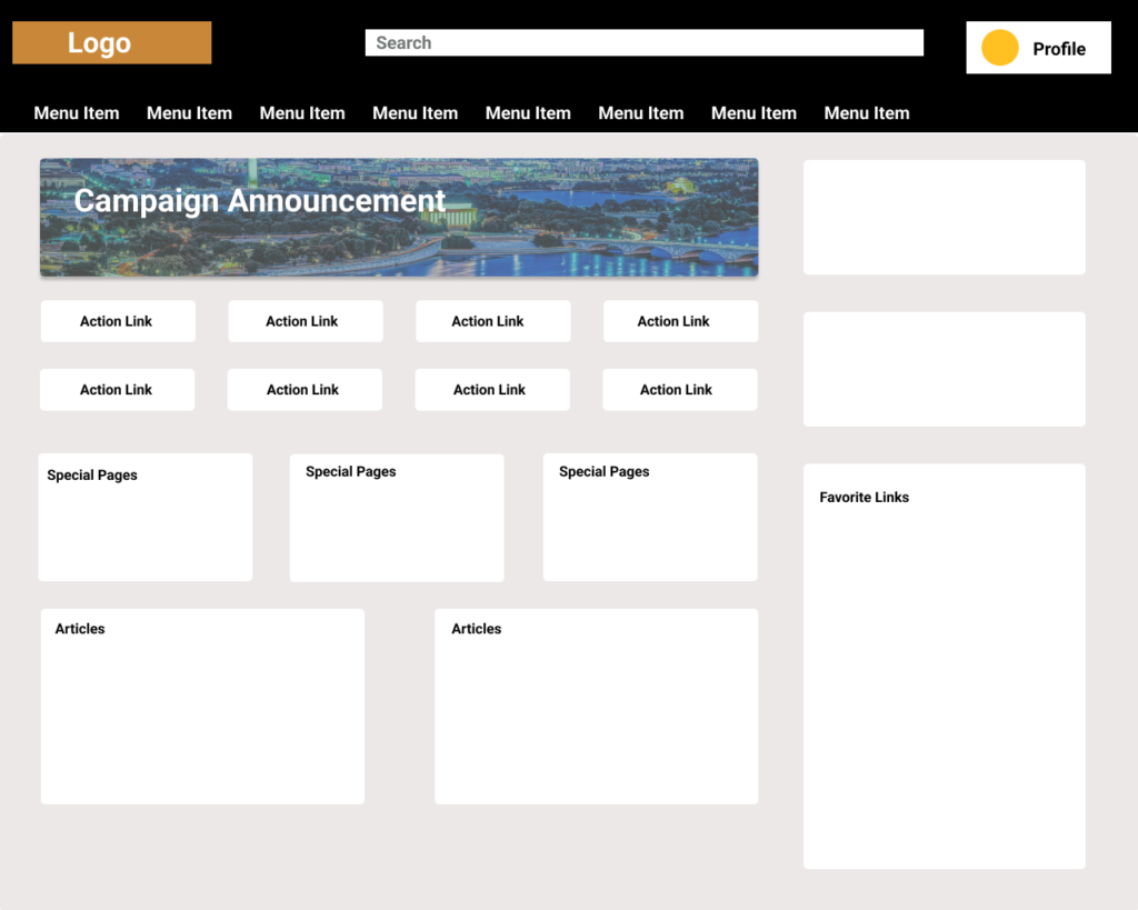
A moderated study was the best way to talk to employees who had been in the pilot about their experiences and counterbalance prototypes for less bias. 16 Moderated, remote session using 2 prototypes and 2 user groups.
Questions (Examples)
Experience
What are/was your first impressions of this homepage?
Task Related
Where would you look on this site to find a list of your current benefits?
Task Related
Where might you find a place to edit your contact information?
Rating
Is this site easy to use? On a scale of 1-7 where 1 is not easy to use and 7 was extremely easy to use.
Observation
Did they use the main menu?
Observation
Did they notice the Profile button?
Analysis
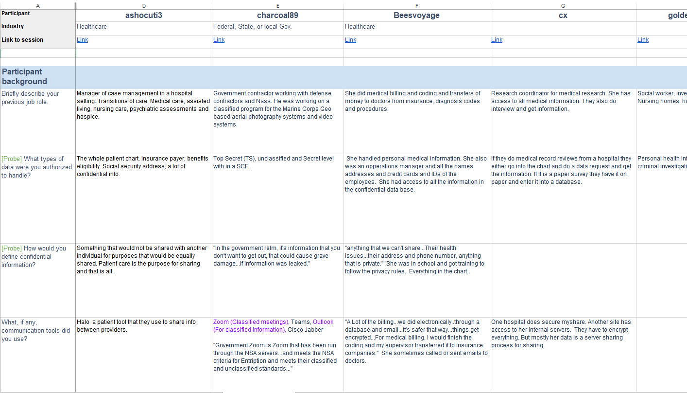
- An excel spreadsheet was created to compile data from study notes and data to be analyzed.
- Common themes and ratings were pulled out into an executive summary to report directly to the UX designer. Together we solidified our UX recommendation to key stakeholders for design change approval.
- Report included detailed images of relevant app features, highlight reels, quotes, and data charts.
Findings
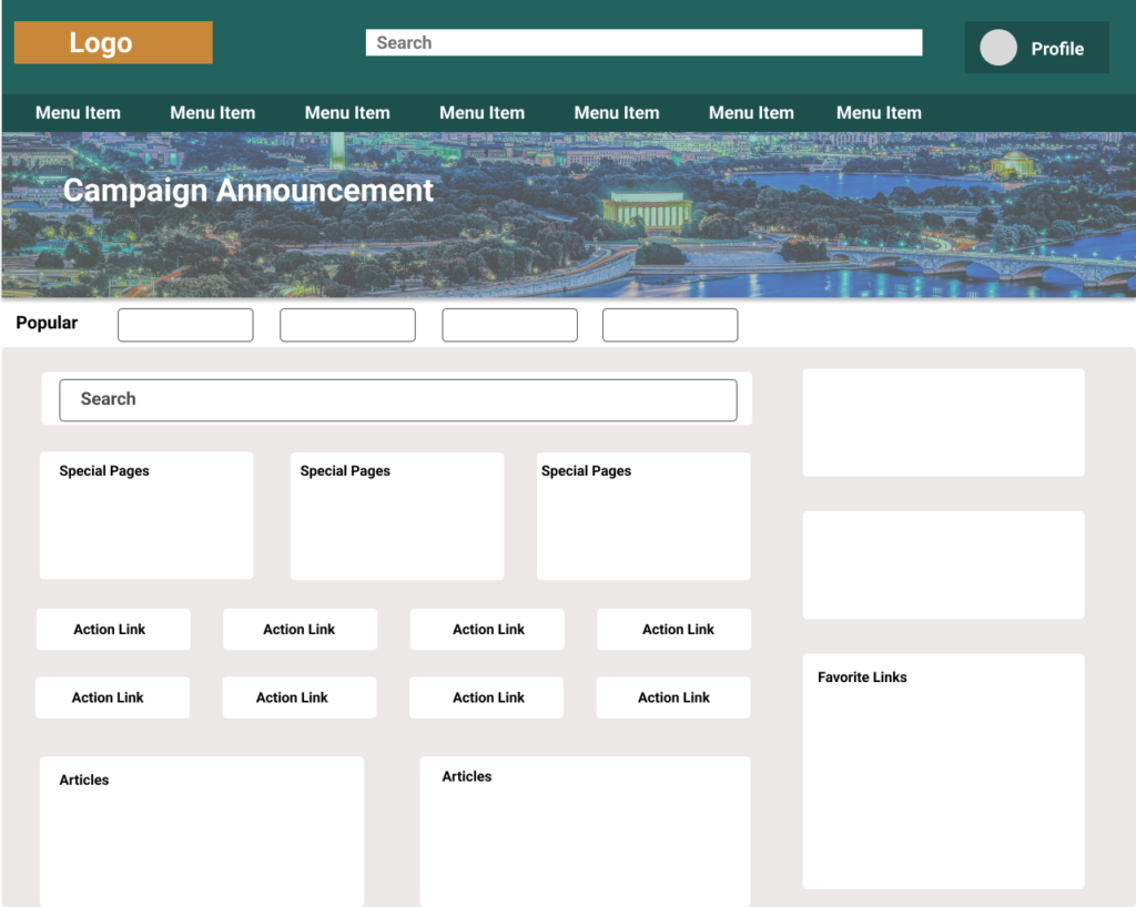
Consistent with previous study findings 70% of all participants thought the homepage for the original design (A) was too busy and crowded.
Half of the participants looked for what they needed on the homepage screen without looking at the menu.
30% of pilot participants reported that during the pilot they had not noticed Favorite Links (most positively rated feature in the pilot).
Consistent with previous study findings the Non-pilot participants did not notice the Profile.
Recommendations
Header and Profile
Change the color of the header to black to match other company systems, and change the Profile button color to white to greatly increase contrast.
Banner
Decrease the size of the banner to allow more homepage and action tiles visibility without scrolling.
Homepage Spacing
Eliminate redundancy and add more spacing between action tiles to increase ease of use and decrease cognitive load.
Menu Quick Links
Add quick links to the drop-down menus of related categories, to better match the mental model of employees while adjusting to the new system.
Impact
After new design implementation, pilot participants were asked to submit a survey to collect data on how successful the design changes were to increase confidence and ease of use. Post-design change data showed a significant increase in positive ratings.
